Ticto
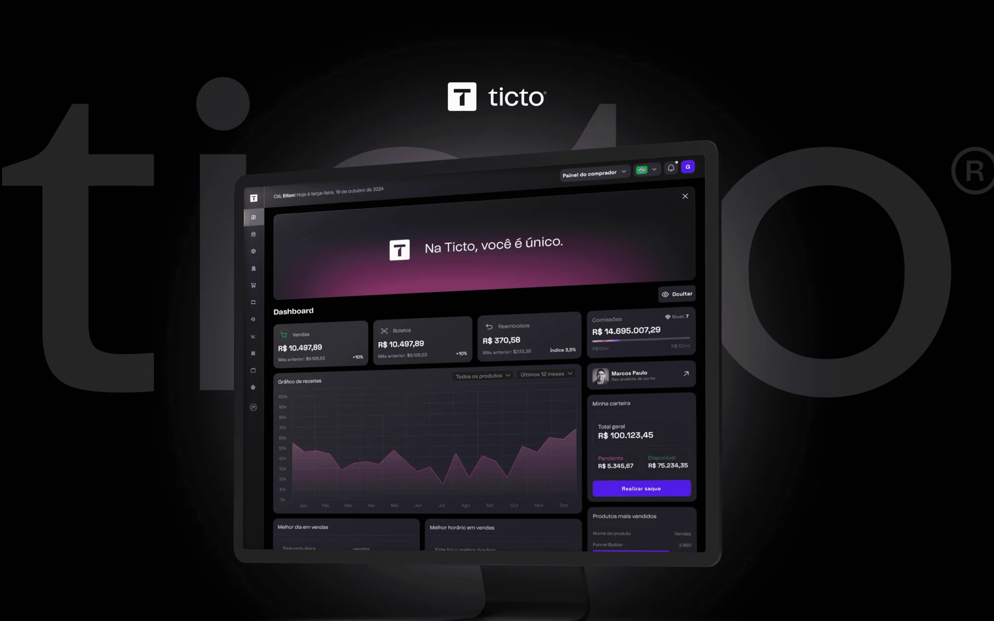
I owned the entire UI of a payments platform used by thousands of creators: from sign-up, which cut TTV (time to value) by 60% according to Ticto's internal team, to the dashboard that became the official app.
Results
60% drop in TTV reported by Ticto's internal team.
The front door decides whether a creator activates or walks away.
Ticto is a digital products and payments platform that thousands of creators use to sell and get paid. Ticto brought me in to work on the product's front door: sign-up and onboarding.
The first-run experience had a lot of friction: long forms, confusing steps and navigation that left users lost, unsure what to do next.
The scope grew along the way. I started with sign-up and onboarding and ended up owning the platform's entire UI: architecture, dashboard, app, gamification and illustrations, plus a new workstream requested by the tech team, identity verification with id-wall.
Onboarding & sign-up
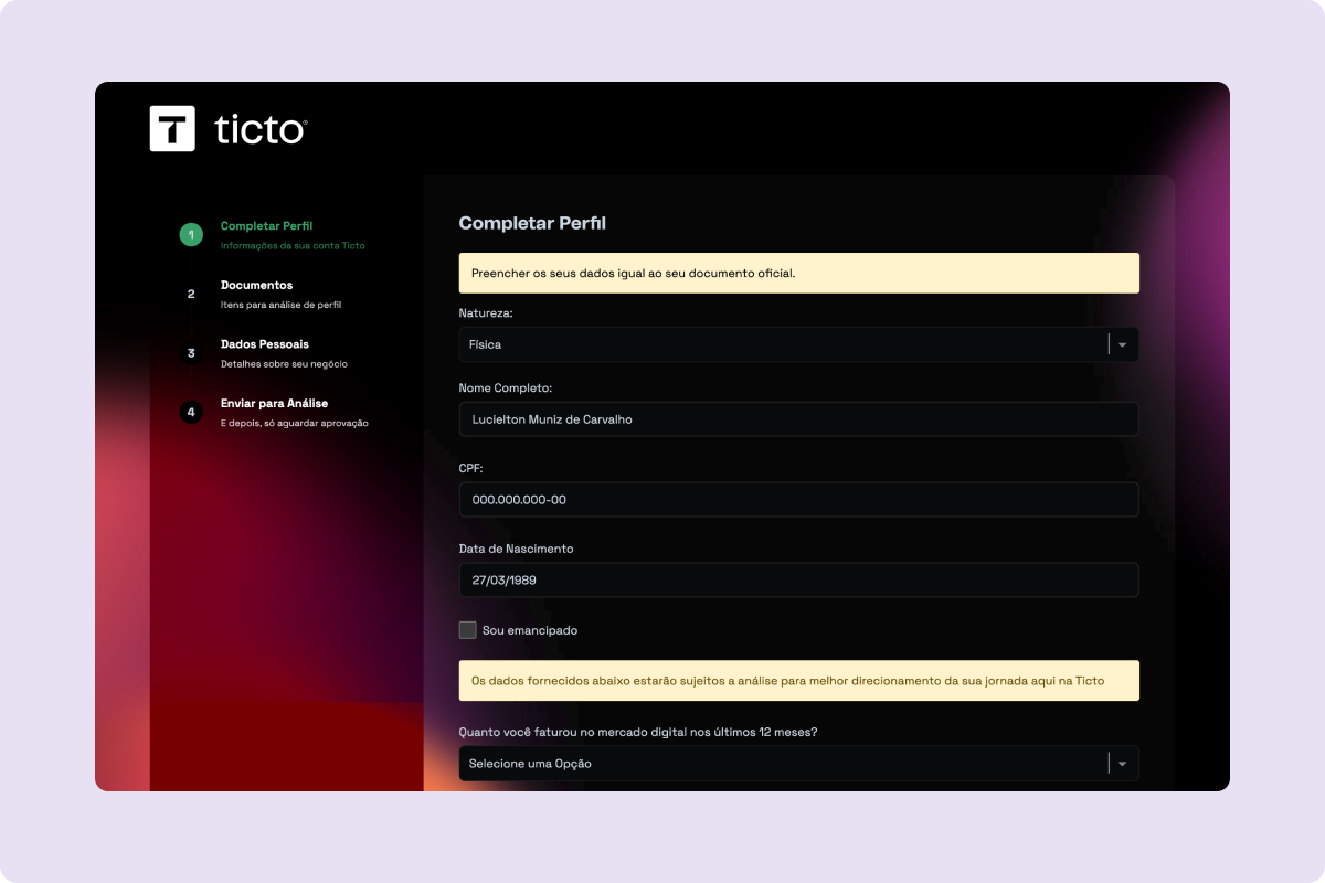
I mapped the friction points in the first-run journey (sign-up → first sale) with the product and data teams. I redesigned the flows around clarity and conversion, reorganized forms around how users think and built reusable components for the design system.
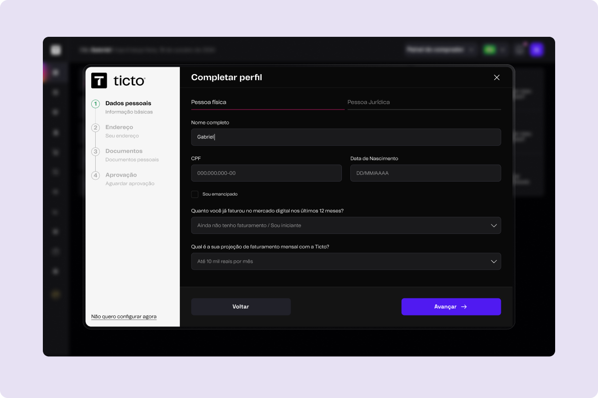
 Before
After
- 01LandingArrival and account creation
- 02Sign-upProgressive data, no duplication
- 03BiometricsIndividual/business verification with fallback
- 04ApprovalClear feedback in every state
- 05First saleTTV: −60%
Verification with id-wall
Biometric verification was identified and requested by Ticto's tech team to raise security and reduce fraud; they chose id-wall for the integration.
I worked on the design of the new screens for the identity process: individual and business flows, error states, a fallback when verification fails, and saved progress so users kept their context when they came back. Biometrics stopped being an obstacle and became a natural step in sign-up.
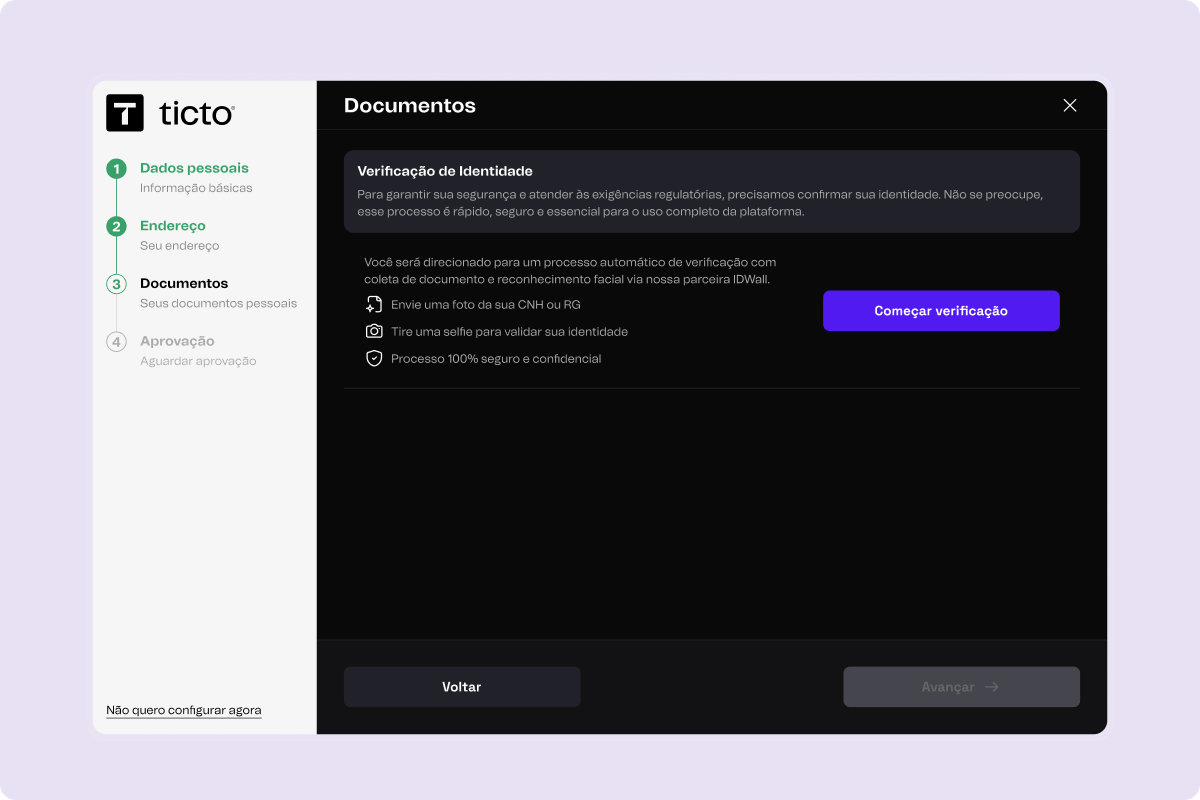
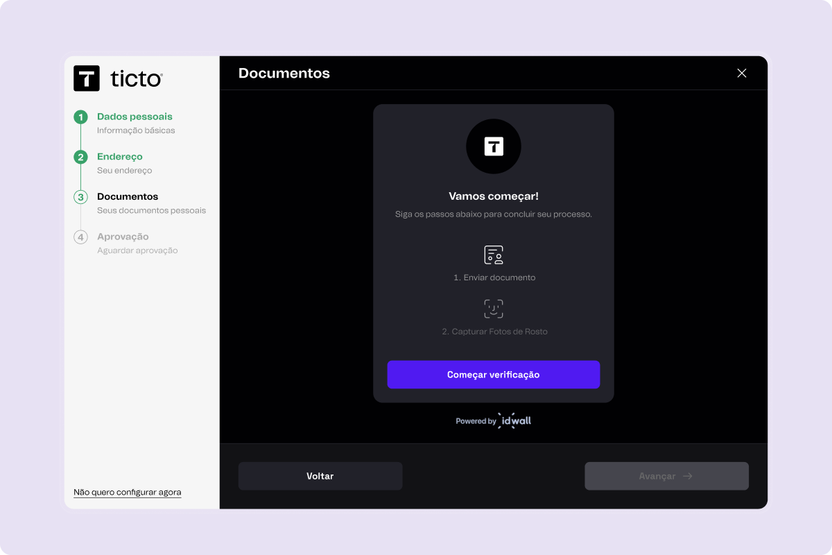
Break sign-up into micro-steps instead of one long form.
With biometrics in the middle of the flow, a single-screen form broke whenever verification failed: users lost context and dropped off.
I chose progressive micro-steps with validation at each stage. Every screen had one clear decision, and failures sent users back to the exact spot without losing what they had already filled in.
The trade-off: more screens to maintain in the design system and more error and loading states to cover. Offset by fewer support tickets and more predictable activation.
The platform's information architecture
After sign-up, users landed in a product with no clear direction: many areas, inconsistent labels, no clear hierarchy. Tickets asking "where do I see my sales?" were common.
I reorganized the information architecture of the entire platform. Menus, groupings, hierarchy and labels were rewritten so users could look at the screen and know exactly which path to take, no tour or guided onboarding needed.
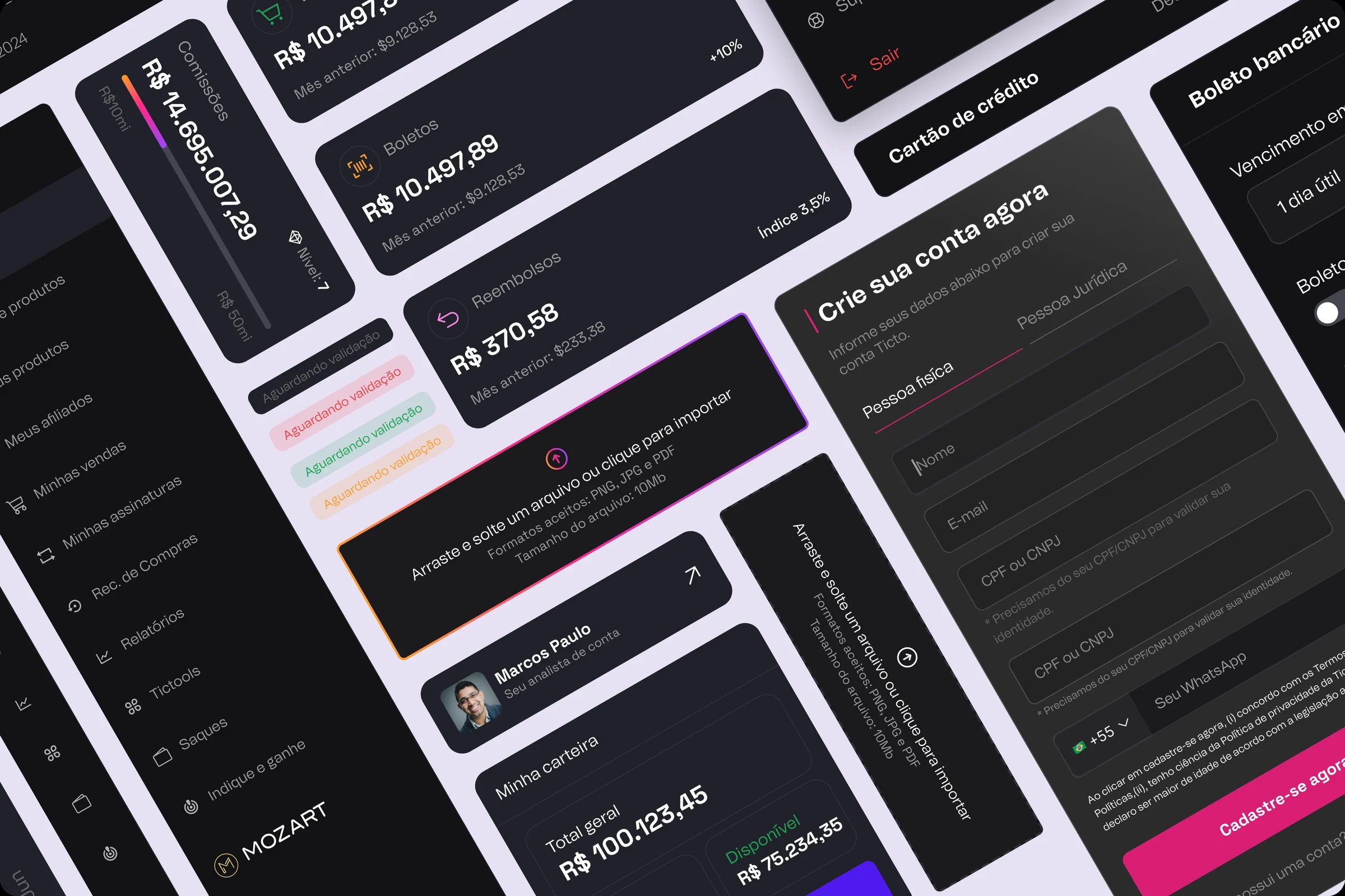
A new dashboard
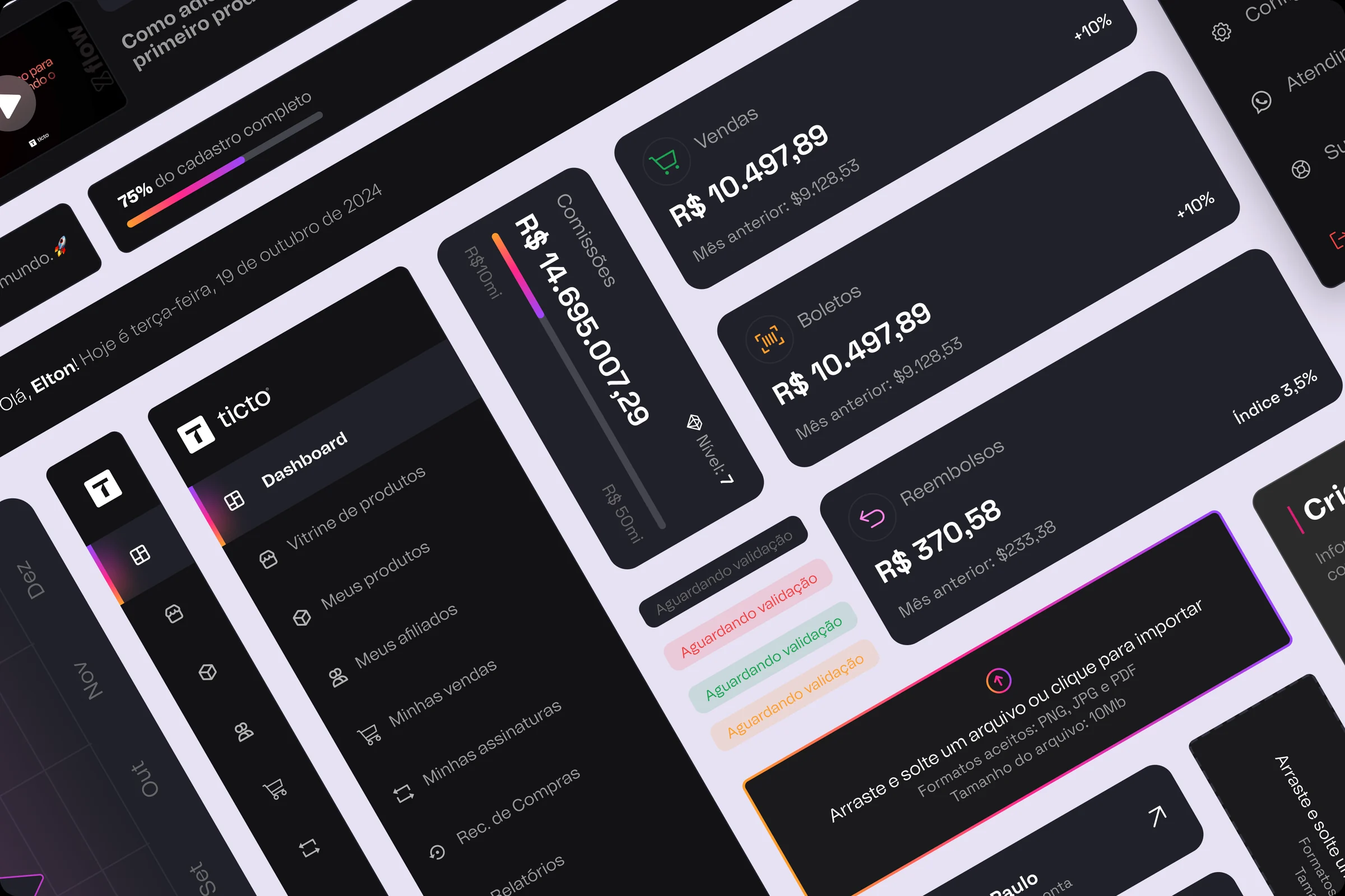
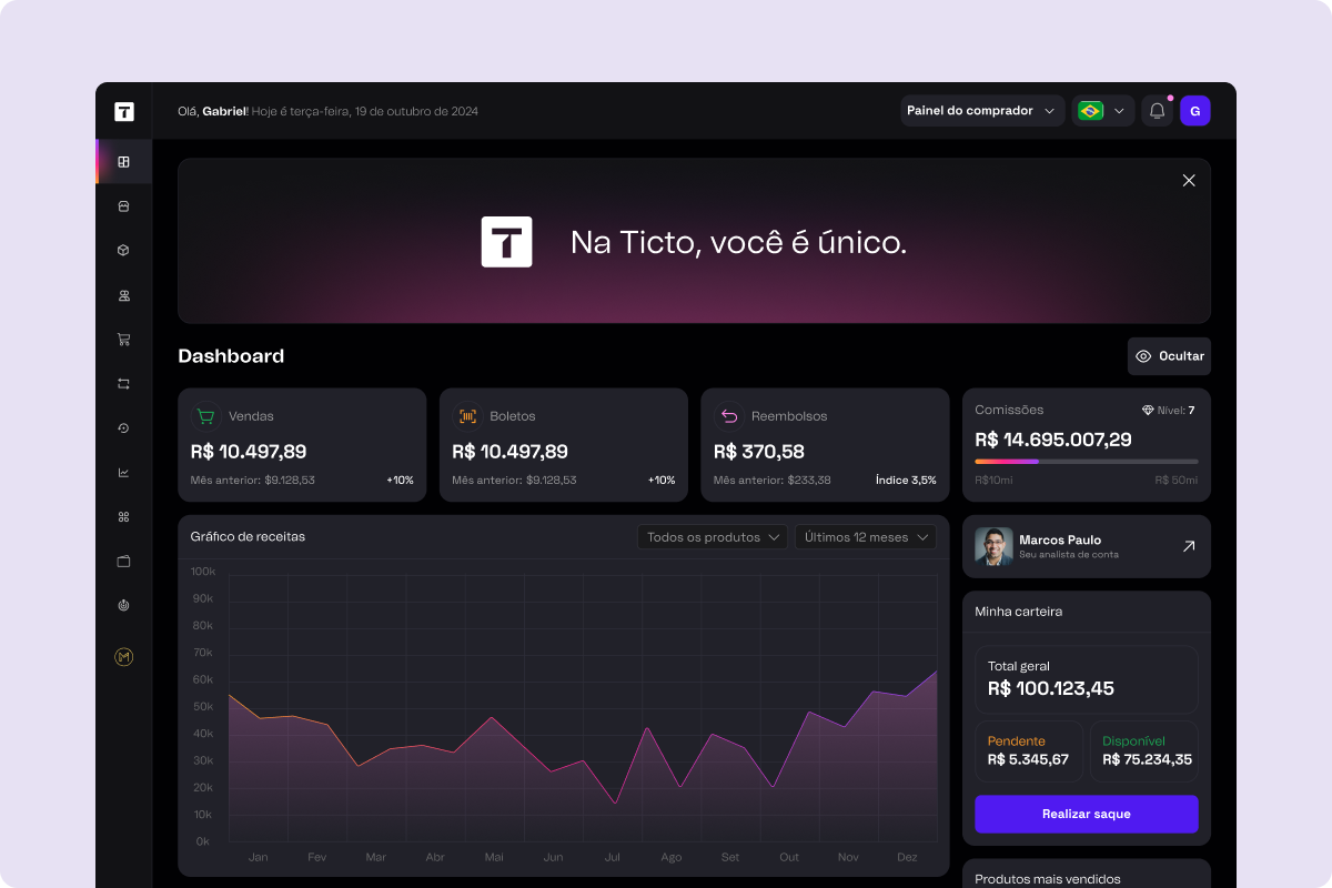
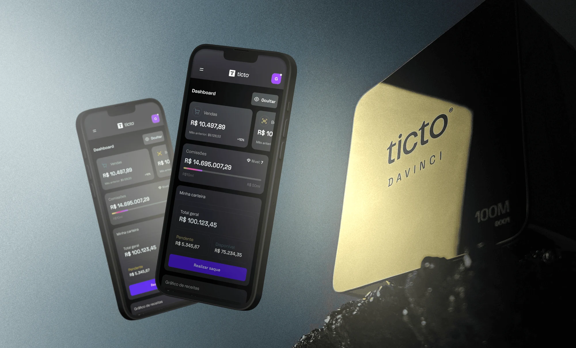
The dashboard became the product's center of gravity. I put there what creators need to see first: balance, recent sales, commissions, the products gaining the most traction. Minimal decoration, maximum clarity.
The layout was designed mobile-first, and the mobile version took on a life of its own: it became Ticto's official app, now in the hands of thousands of creators.
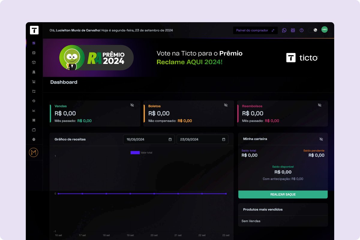 Before
After
Rewards & gamification
Every revenue milestone became a moment of celebration: from the first sale all the way to R$100 million, creators get a surprise achievement modal announcing a symbolic physical reward (trophies and plaques honoring visionaries like Spielberg, Turing, Gates and Da Vinci).
It isn't decoration: it's a narrative layer that treats creators as part of a journey and gives weight to metrics the platform always had.
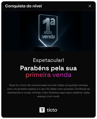
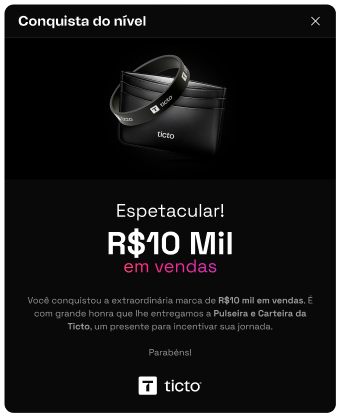
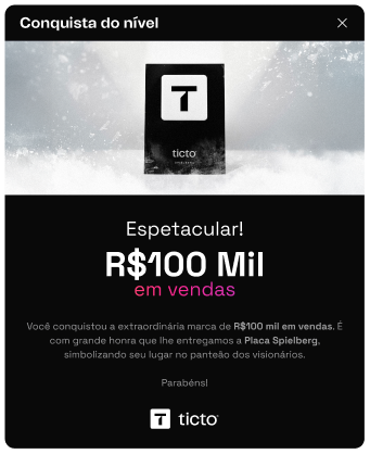
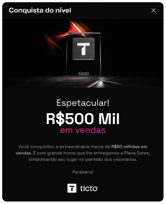
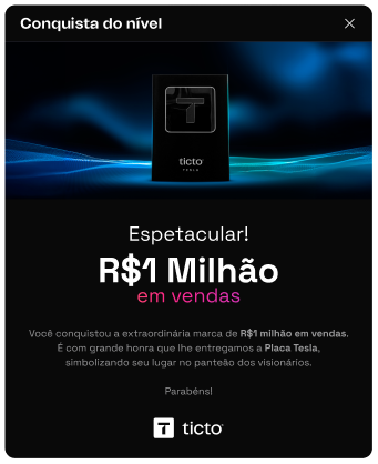
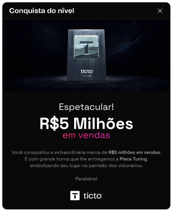
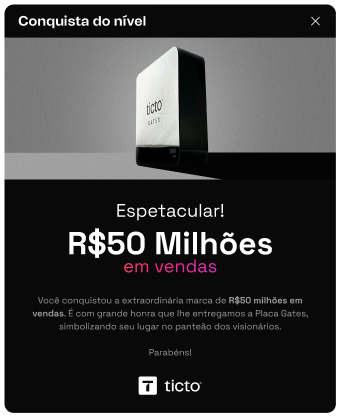
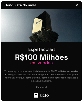
Eight milestones, from the 1st sale to R$100 million. Scroll sideways.
Illustrations for the interface
Beyond the screens, I created 6 isometric illustrations for empty states, status messages and onboarding. Personality where users need context or a visual breather, without losing the restraint of a financial product.
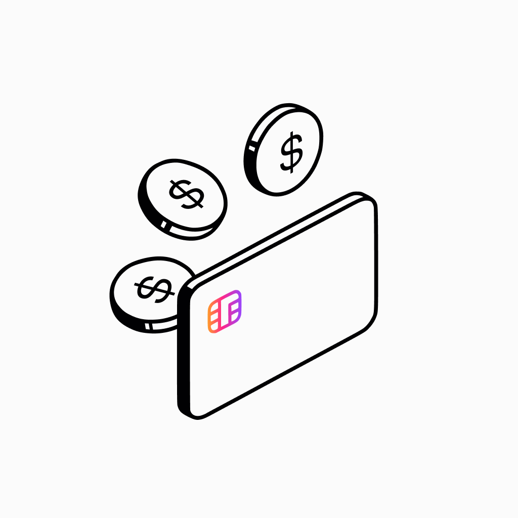


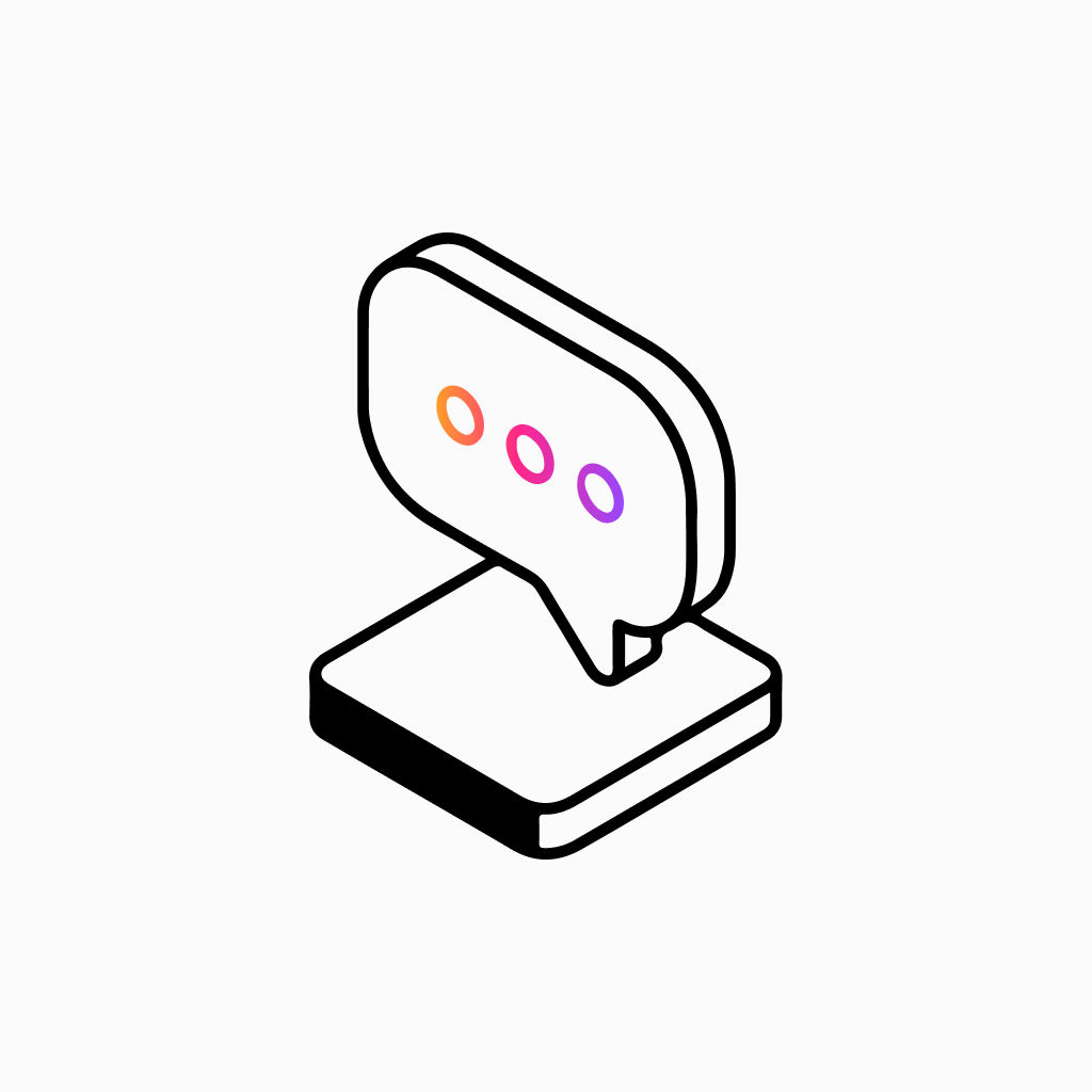


Design isn't just aesthetics. It's a tool for conversion, education and connection.
Next case study
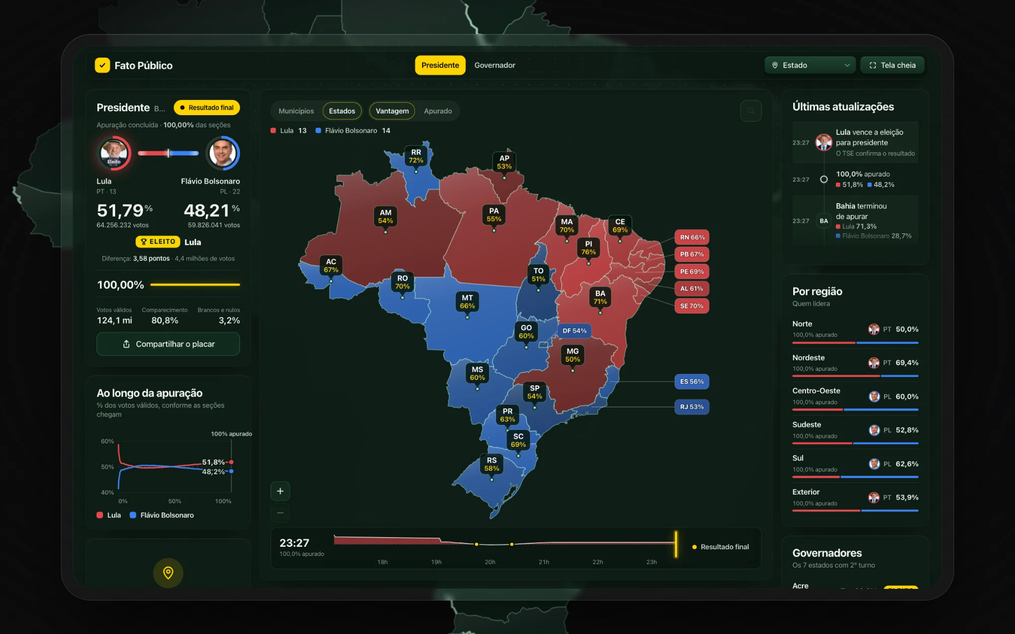
Fato Público · 2026 Elections
Live vote count for Brazil's 2026 elections and a public data portal. Product, design and code.