Clickmax
I audited the platform's components and dark mode and moved its forms to the design system in 25 days, using AI for the implementation. The platform became consistent in light and dark mode, stopped flashing white on load and shed four bugs that were live in production.
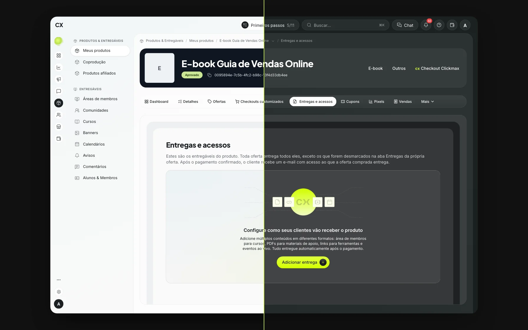
Results
- Billing
- Freezing
- Forms
- Sign-in
Figures measured in the platform's code and in each release's tests, between September and October 2026. Screens are from test accounts.
One dark mode per screen
Clickmax is Bilhon's platform for pages, funnels, CRM and sales. Dark mode already existed, but every screen handled it on its own: there were more than 20,000 hand-written dark-mode classes in the main app alone. Fixing one screen didn't fix the next.
The team kept reporting the symptoms: white text on a white background in Products, unreadable lists in the messaging channels and 1.6 s of white screen on every load in dark mode.
Underneath it all was one cause: duplicated components. On October 2, 326 files still used the form fields that predated CXDS, the platform's design system, and 37 used local tabs. Of those files, 295 belonged to the product screens and made up the scope; the visual builders and the Kanban were left out by product decision, since they have their own roadmap. The old field was 56 px tall; the CXDS one, 40 px. Two platforms living on the same screen.
The starting point · five real screens in dark mode, before and after
Measure before replacing
An inventory in the code. A script counts the files that still import an old field or tab. It ran on every merge, and that count, not an estimate, was the number I reported to the team.
The ladder. Proposed by André, the Design Lead, and applied to every screen: use the component that already exists; adapt the screen to an existing pattern; create a new pattern in the design system, for everyone; only then allow an exception. A serious visual bug became an urgent fix; a missing pattern became a component.
The guardrail. In 4 days without a guardrail, 5 new files were created with the old field. Before the first replacement, a lint rule started flagging every new use. From then on, the number only went down.
Area by area. Marketing, Members area, Products, Leads and Contacts, Messages, Integrations, Settings, Sales and, last, the sign-in screens. Each area became one PR, always following the same path, described in the next section.
AI executes. I decide.
I built it with Claude Code acting as a senior developer. The rule that made the biggest difference: it decides anything technical and reversible on its own, and asks about anything that touches product, visuals or someone else's work, or that can't be undone.
One session per PR, several in parallel. A coordinating session manages the machine's queue, the status of each PR and the scoreboard.
1Prepare
- 01Small cardme
- 02Session and worktreeAI
- 03Kickoff promptme
- 04The planI approve · checkpoint
2Build
- 05BuildAI
3Prove
- 06EvidenceI approve · checkpoint
- 07Checks and docsAI
- 08Independent reviewanother AI session
4Ship
- 09Commit and PRI ask
- 10After the PR opensengineering reviews and merges
Fix it once. Whatever went wrong in one PR becomes a rule in the prompt and in memory, so the next area starts without that mistake.
Scale. Each PR ran in an isolated copy of the repository, with a kickoff prompt that set the scope and the limits. That way, several areas moved forward at once without stepping on each other.
Speed on the repetitive parts. In the first area, a codemod replaced 70 labels, 34 text fields and 7 text areas in 4 seconds. The 31 cases that weren't mechanical were done one by one.
A second read. Before every commit, another session read only the diff, looking for bugs. One of those reads surfaced a bug that was already in production: when a subscription switched from annual to monthly, the 12 installments stayed active behind the scenes, while the field showed empty on screen.
Don't rebuild what already exists.
In one of the first PRs, the AI rewrote the tabs to make them “cleaner” and broke the platform's identity. That became a rule in every prompt: if a screen is the reference, use exactly the same component, adjusted only through its props.
What this shows: AI doesn't know what a product's identity is unless someone tells it. Without that limit, speed turns into rework.
The full process, with the lessons learned.
The flow of each PR, the build rules, the evidence, the coordinating session and the pitfalls, explained step by step. The skill and the prompt templates are free and open.
Bugs the migration uncovered
Every component swap meant going over the screen with a fine-tooth comb. Along the way, I found problems that were already in production, in places nobody had asked me to look. These four had the biggest impact: they blocked people from using the product, hid errors from whoever was filling in a form, or affected billing.
Invisible errors in dark mode
Six field components lost their red error border in dark mode, and the error text fell below AA contrast in light mode. People who got a field wrong couldn't see where. The fix went into the component and applies to every screen.
Affiliate terms, new contact and test form · before, a field with an error didn't stand out
A phone field that froze the page
Typing fast in the phone field threw the screen into an update loop, and the page stopped responding. The automated test types slowly and never caught it. The fix went into the shared component, with a heads-up to every team.
Simulation of the symptom · typing fast in the phone field
A monthly subscription in 12 installments
When an offer switched from annual to monthly, the screen showed empty installment fields, but the 12 installments stayed active behind the scenes. Now installments follow the billing period: monthly means 1x.
Edit offer · frequency from annual to monthly, real screens
Password recovery broken on mobile
On mobile, the screen overflowed its width and, in dark mode, the title and instructions turned white on a light card. Password recovery now lives on the back of the login card: it fits the screen and works in light and dark mode.
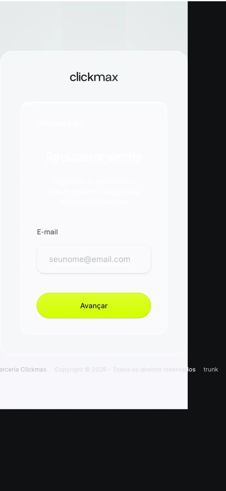
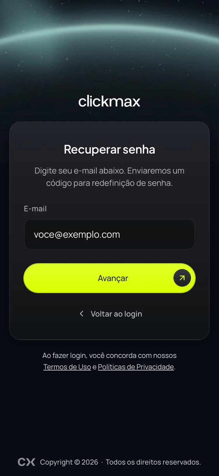
Password recovery at 375 px · in dark mode
Decisions and their costs
Fix it in the design system, not on the screen.
The theme changes the token's value, not the screen. One adjustment to a component applies to the whole platform and leaves room for new themes without touching the screens.
The cost: the fix reaches screens outside the PR. The select component alone was used in about 150 files. Every component change came with before-and-after screenshots of existing screens and an explicit note in the review.
One area per PR, with the sign-in screens last.
Each PR fit into one careful review and could be rolled back on its own, without taking the others with it. Login, sign-up and password came last, in a separate PR.
The cost: more PRs and more review rounds for the engineering team: 33 between October 6 and 30.
Keep anything that wasn't a form field out of scope.
In the builders, the canvas is the customer's content: only the interface around it got dark mode. The Kanban was left for another workstream. In Webinar, two selectors deliberately keep the old tabs component: they pick an option, they don't navigate. CXDS was missing a segmented control, and that became a card for the design system.
The cost: 23 files still use the old field, all out of scope and logged.
Two-level tabs. André and I settled on a single rule: if any tab has sub-tabs, the main strip becomes pills with icons, a new component in CXDS, and the sub-tabs attach to the panel. Whatever doesn't fit the width goes into a “More” menu, which shows the page that's open.
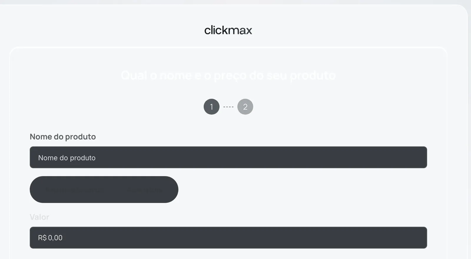
Side by side, in dark mode
In fix-up work, a correct screen just looks normal. The difference only shows side by side, which is why every release came with before-and-after screenshots.
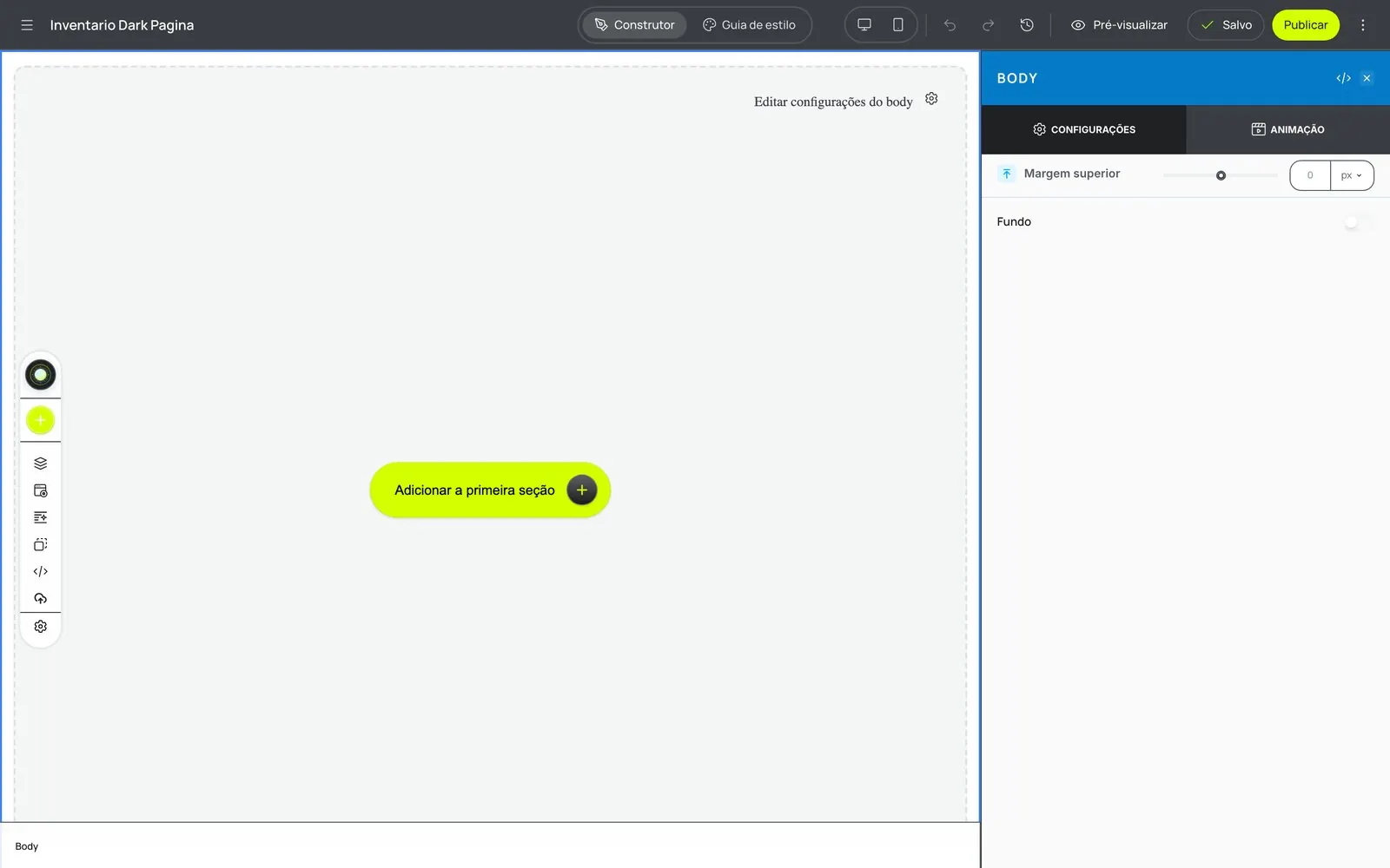
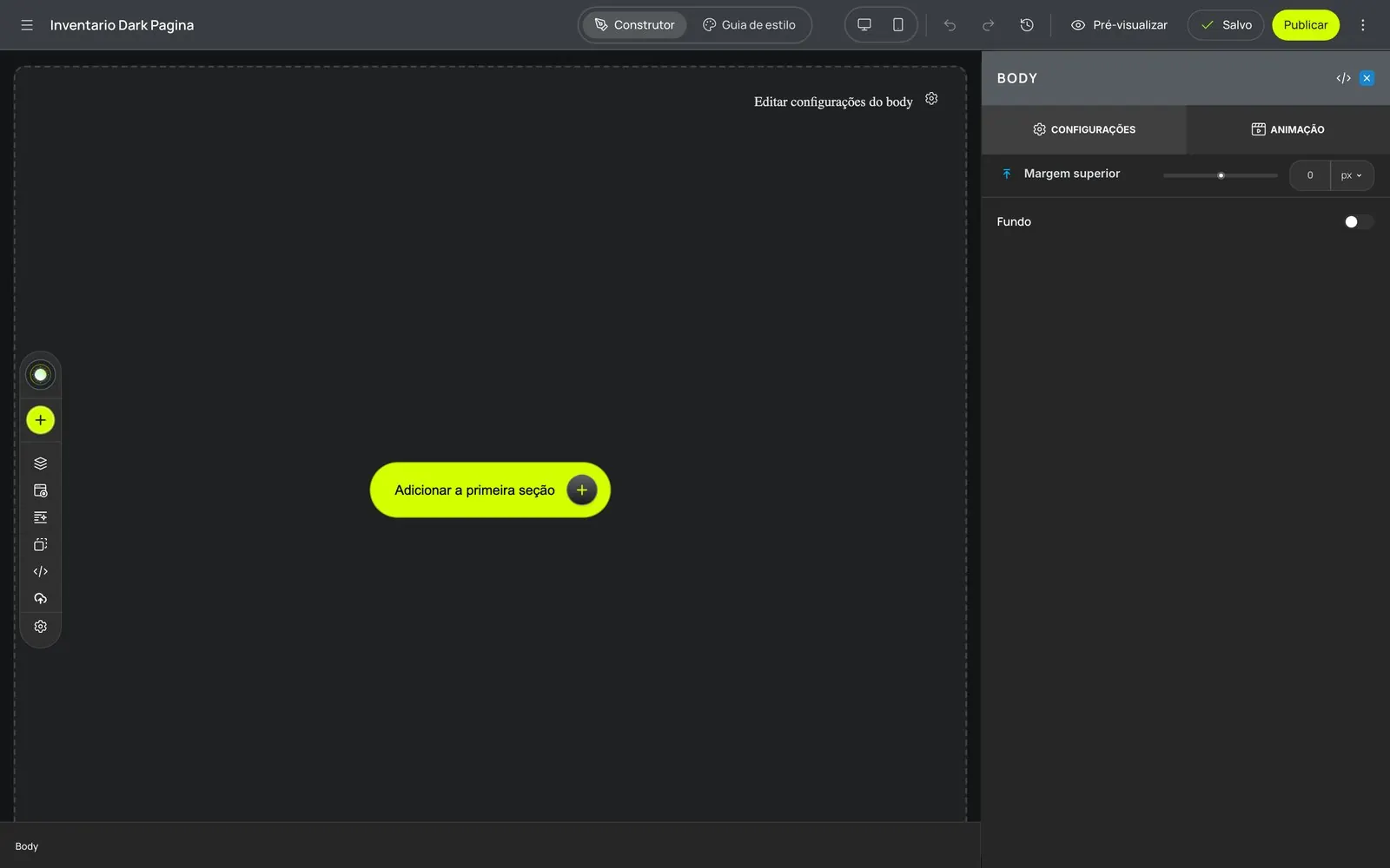
Start here · the title and options disappeared in dark mode
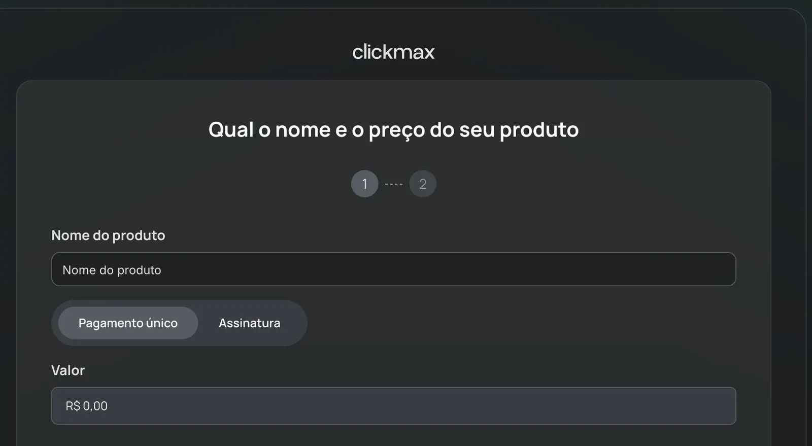
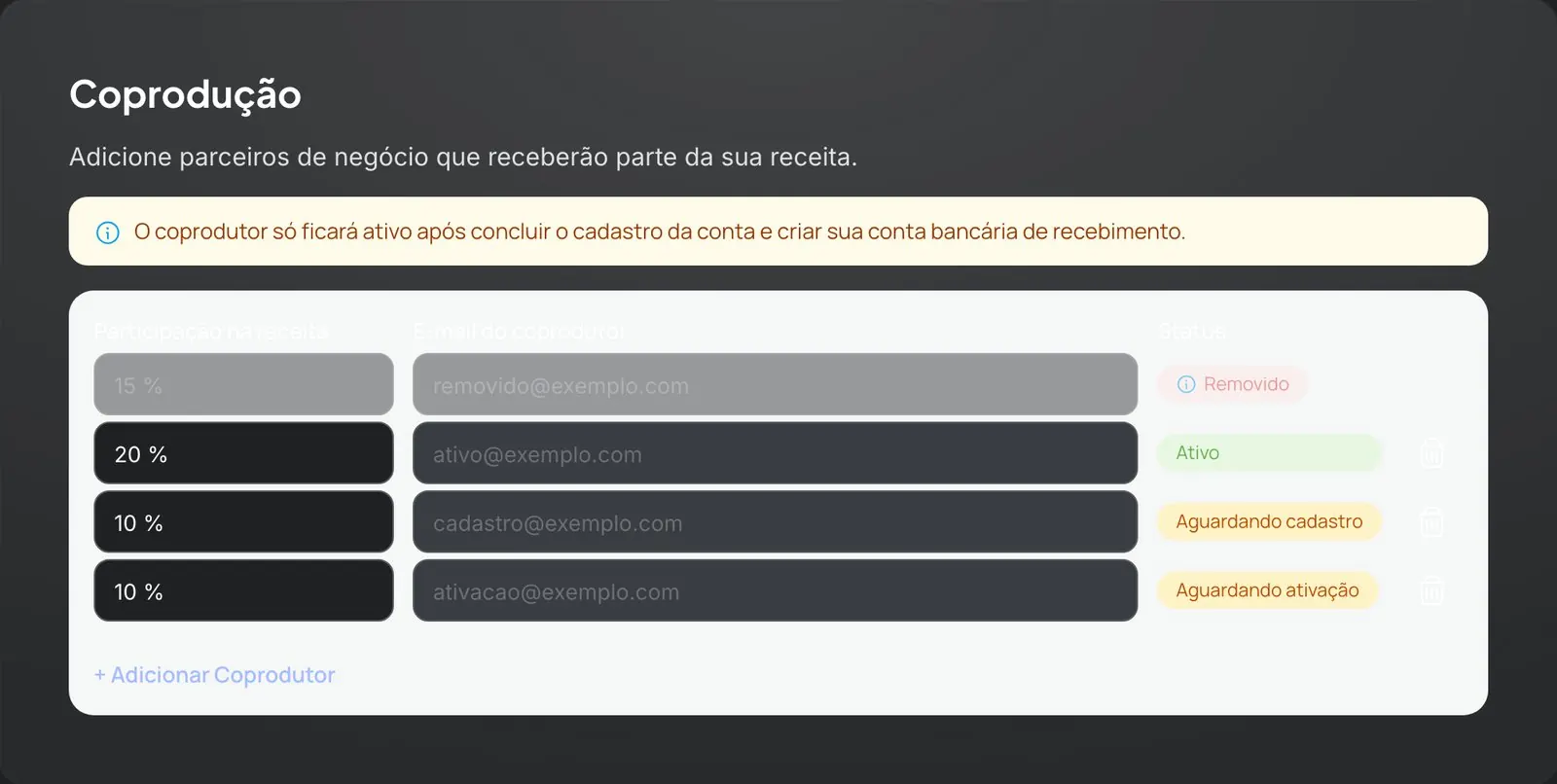
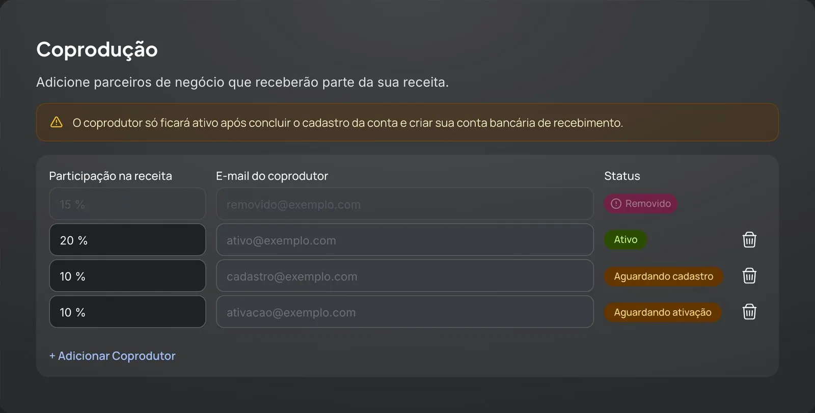
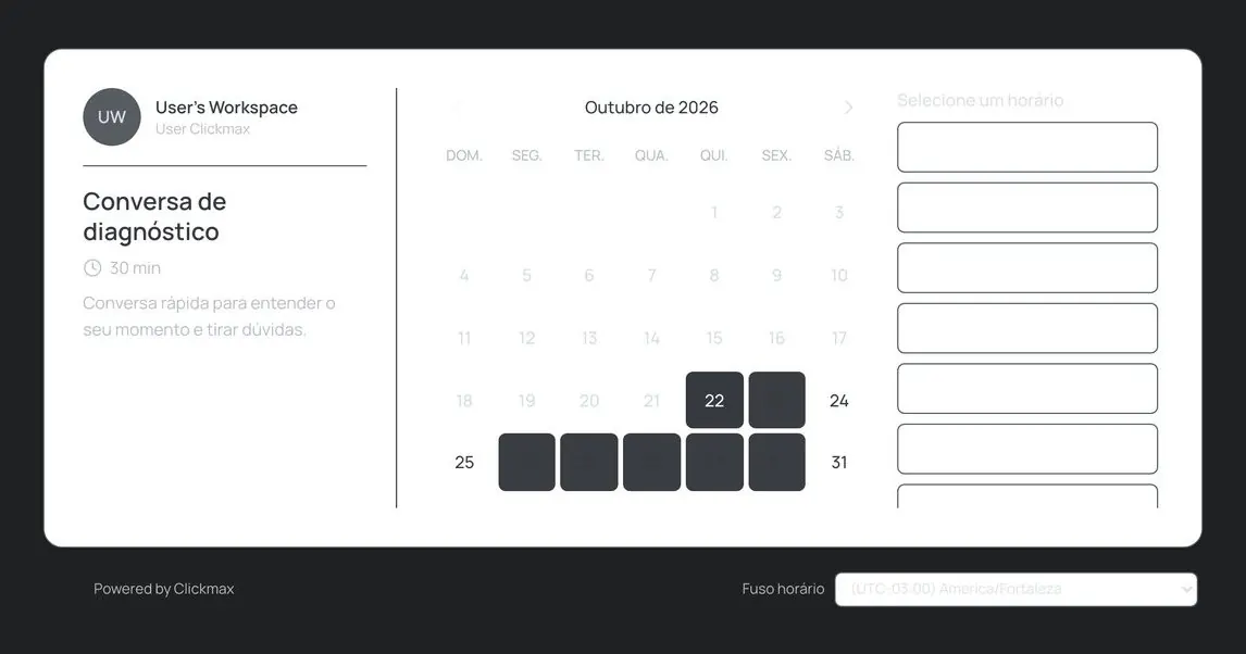
What the platform gained
The gain didn't stop at the screens I reviewed. It changed the cost of maintaining and evolving the platform.
Fix once, every screen benefits
Dark mode moved out of the screens and into the design system's tokens. One adjustment to a component updates the whole platform, and a guardrail in the code keeps the old field from coming back: before it, 5 new files with the old field appeared in 4 days.
Four fewer production bugs
Invisible errors in forms, a phone field that froze the page, a monthly subscription with 12 installments and password recovery broken on mobile. None of them were in the request, and all of them were fixed at the root.
Readable and accessible in light and dark mode
The platform opens without a white flash, the fields share one look and the error text passes AA contrast. The app also got lighter: the Marketing area alone cut 22 kB from the bundle.
From design to code, no queue
Design, implementation and evidence came out of the same AI-assisted flow. Engineering came in for review and merge: 33 releases in 25 days. And with everything in tokens, a new theme doesn't require touching the screens.
The theme changes the color, not the screen · four real screens, the same components
Opening the platform in dark mode · played back at the measured timingThe line marks the load time
The same approach now covers mobile. The audit covered 80 screens and states at 375 px and 20 tables on iPad, with findings grouped by root cause. The first three fixes are already live, and each one improved several screens at once.
What I'm taking with me
- Before and after is the deliverable. Without the comparison, fix-up work goes unnoticed, even by the people approving it.
- A scoreboard in the code, not in a spreadsheet. The scripted count showed the number climbing before the guardrail and kept the conversation with the team grounded in facts.
- Measure back to back. A performance measurement taken hours apart produced a false +21%. Since then, before and after run in the same window.
- Swapping components is an audit. The most serious problems were on screens nobody had asked me to look at.
- AI extends the reach of people with judgment. It replaces 111 fields in 4 seconds and runs tests overnight. Deciding what's a pattern, what's an exception and what stays out is still design work.
How I audit and fix a platform with AI
The method behind this case, step by step: 10 steps, 2 checkpoints and 8 lessons that became rules. With the skill and prompt templates to use with your team.
Next case study
Ticto
The entire UI of a payments platform, from sign-up (−60% TTV) to the app.