Clickmax
A structural redesign of CX Admin. Two navigation surfaces became one. Funnel templates, which couldn't exist without code, became a self-service flow that takes a few clicks. I owned design and implementation, front end and back end, with code review from engineering and QA sign-off on every PR.
Results
Data in the screenshots is illustrative. This case is ongoing: the platform keeps improving with every release.
Context
Clickmax is Bilhon's SaaS product for page building and conversion funnels. CX Admin is the back office behind it: where the team moderates products, supports customers, publishes templates, tracks finances and keeps the platform running from the inside.
I worked on this with André, the team's Design Lead. He led the redesign of the Products and Customers screens; I owned the structural navigation (the new sidebar) and the full architecture of template management, from problem to hypothesis to shipped code.
The challenge
Two navigation surfaces competing for attention. The old CX Admin had a top menu with the main areas (Products, Customers, Marketplace, Support, Finance, Templates…) and a side rail with the active area's sub-items. Operators had to read two regions to know where they were, and the side rail only earned its place when an area had two or more sub-items. Everywhere else, it was dead space.
Funnel templates were an engineering asset. Every new template had to be built in code by the dev team: ticket, sprint, deploy. There was no way to manage them inside CX Admin. In practice, that meant a stagnant catalog, a growing backlog of "create template X" requests, and engineers spending days every sprint on curation, not engineering.
Unified sidebar
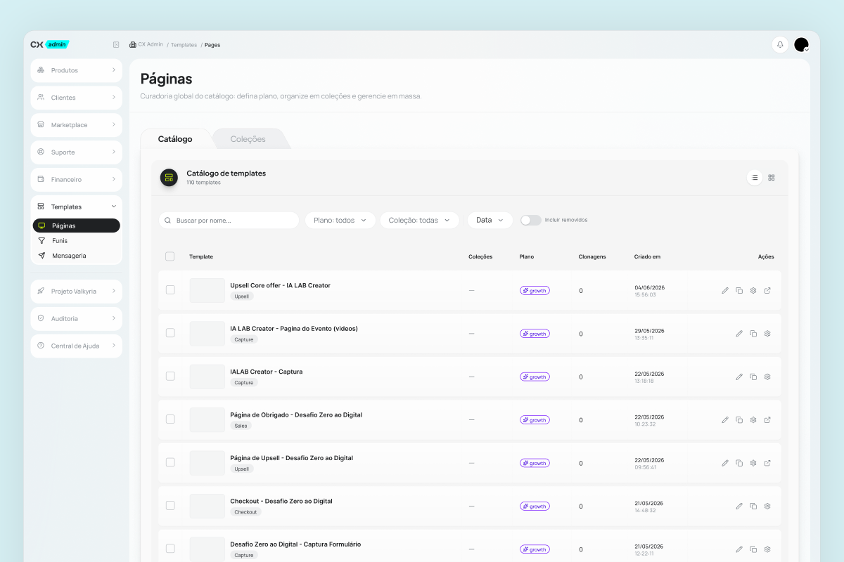
I merged the two menus into a single sidebar. Each area is an expandable block; when an item has children, the secondary navigation opens inline, inside that same block. Nothing spills into another part of the screen.
The top bar stops carrying navigation and does what it does best: orientation. Breadcrumb on the left (CX Admin / Products / Overview), notifications and account on the right. One read, one decision, one click.
The structure has room to grow: new areas or sub-items slot in without a redesign. What used to be a recurring architecture problem became a content decision.
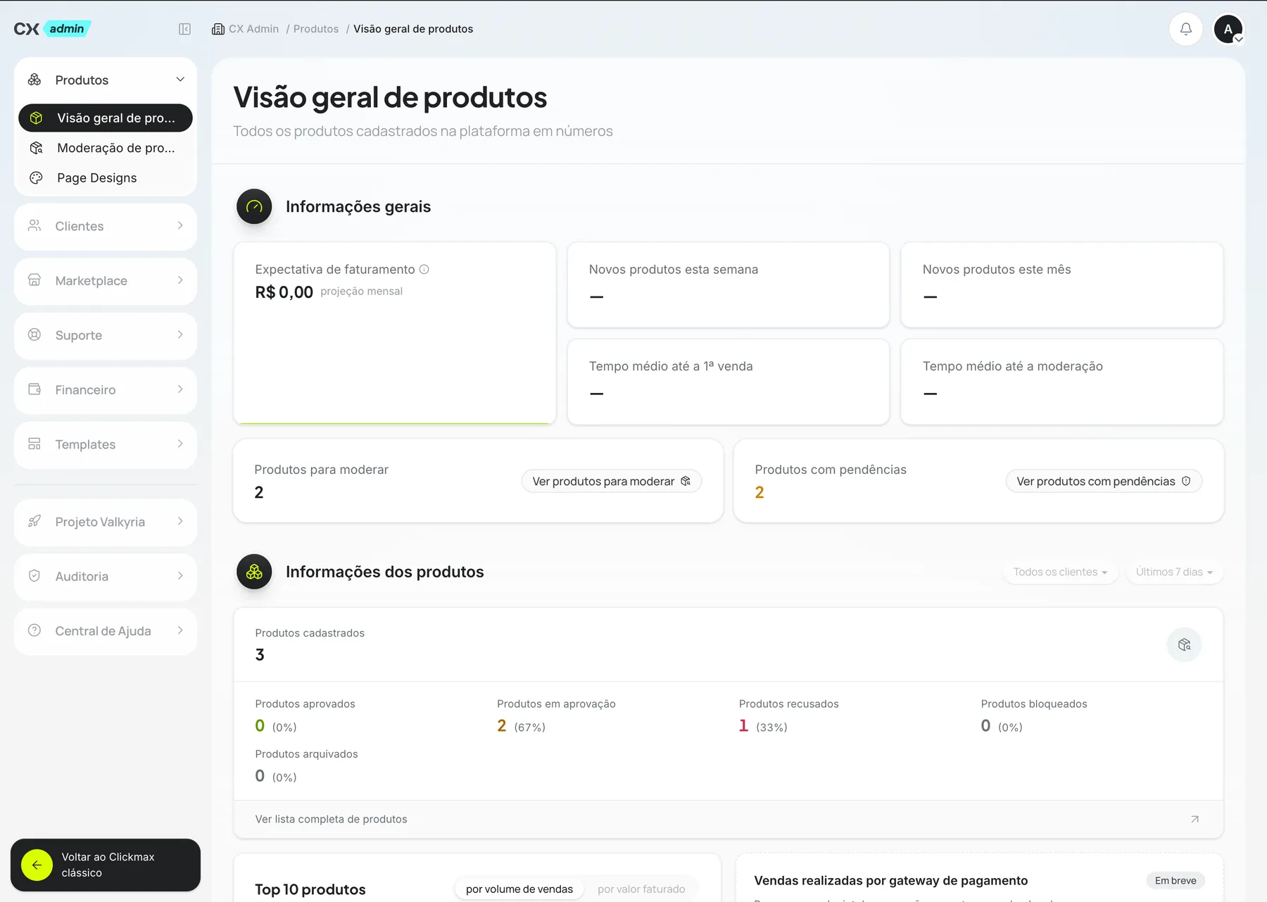
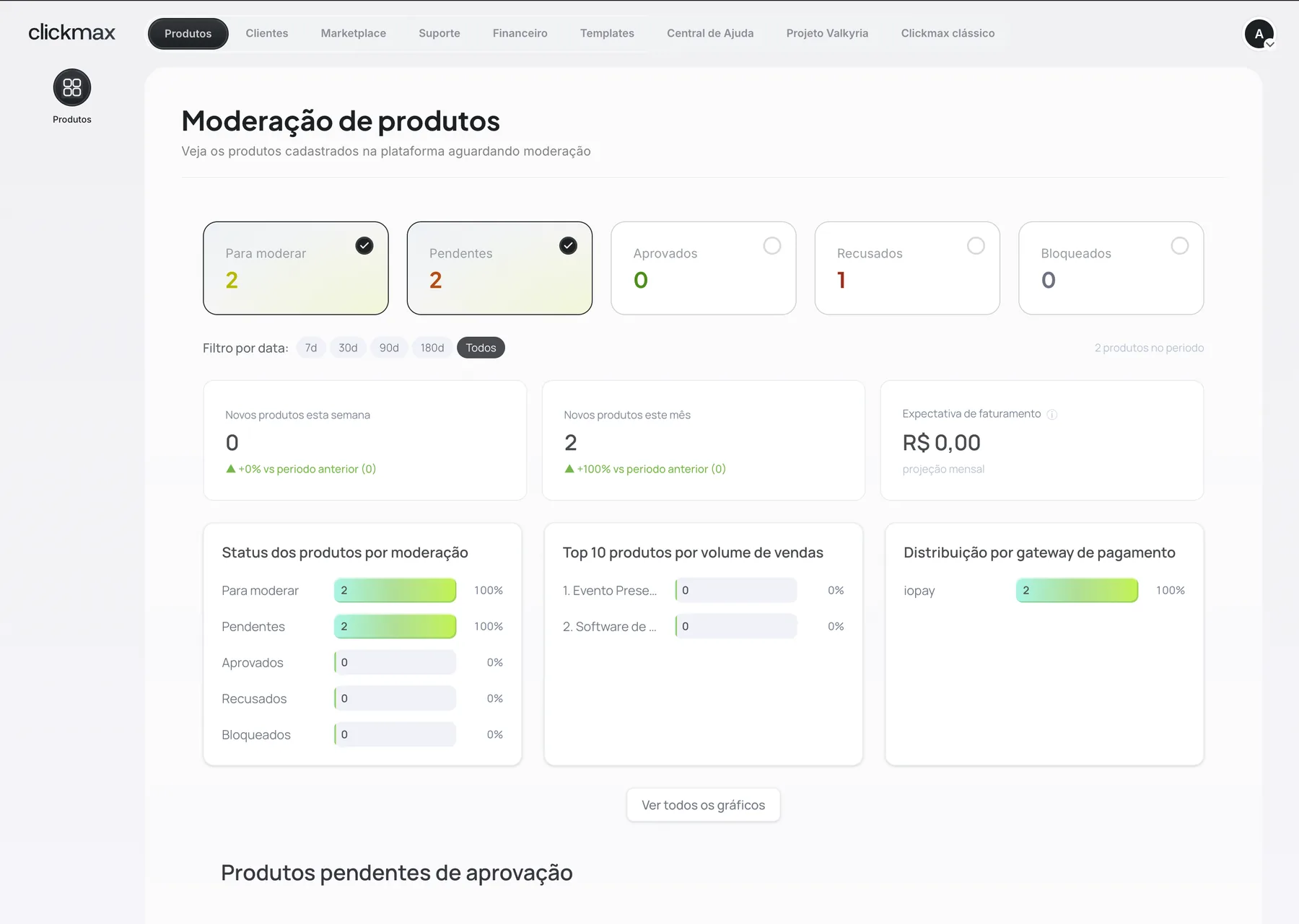 Before
After
End-to-end templates
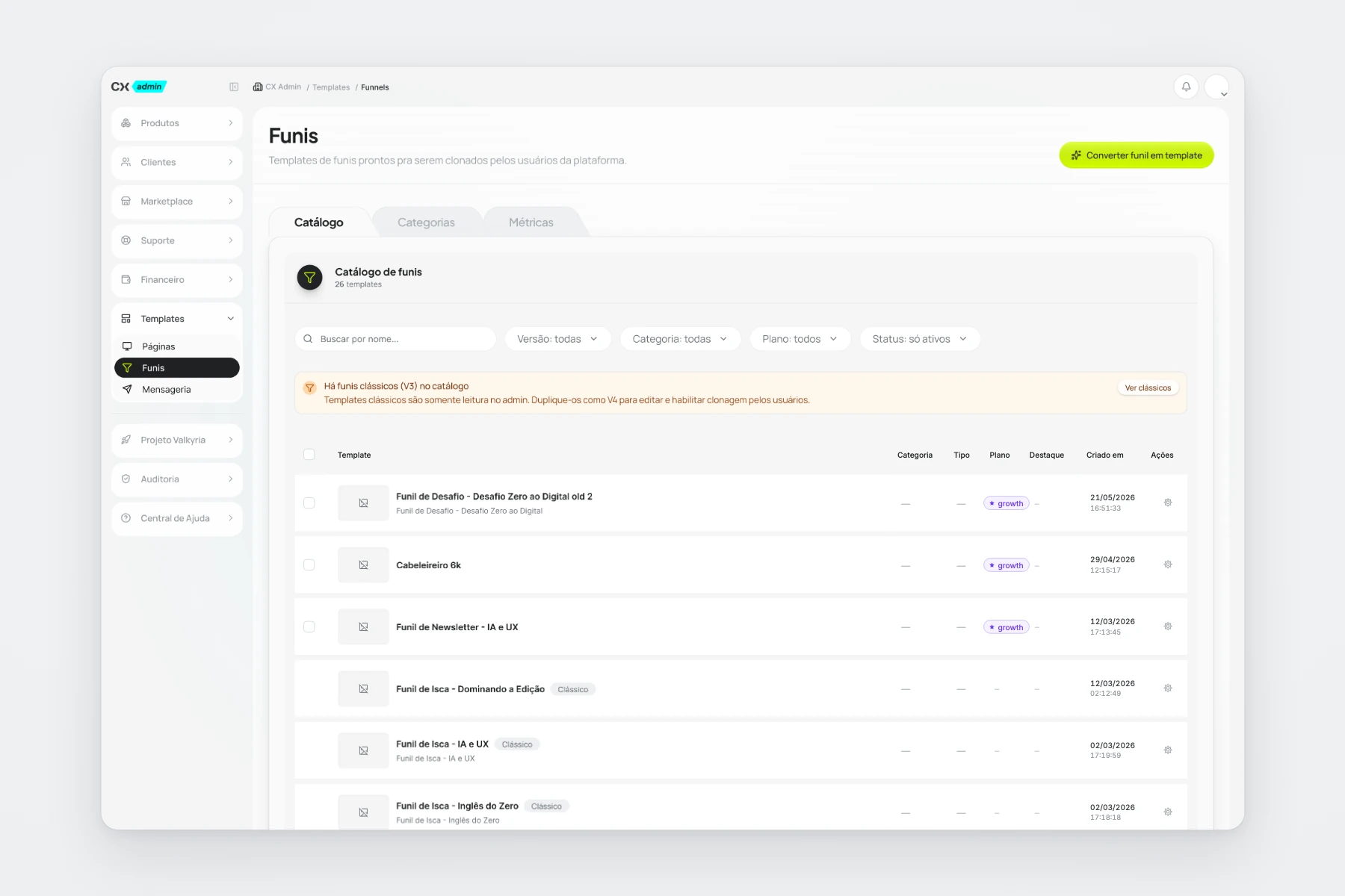
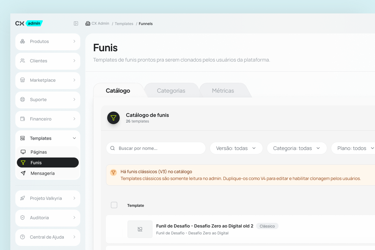
This is where the case moves from interface to product impact. Publishing a funnel template, which used to mean an engineering ticket + deploy, became a flow inside CX Admin itself:
- The admin selects the user who owns the base account.
- Picks the workspace and the project.
- Selects the eligible funnel to turn into a template.
- Sets the cover and description (the platform suggests the copy automatically).
- Assigns a plan and a category.
- Publishes it to the catalog.
A few clicks now do what used to take a file in the repo, code review, merge and deploy.
I designed the architecture, the states, the data model and the flow. I built the front end and back end with AI assistance (Claude Code). Every step was reviewed and approved by the engineering team. Nothing merged without a senior developer's review.
The problem wasn't aesthetic. It was structural.
The old CX Admin was already visually polished. The choice here was to tackle the real cost (two menus splitting attention, engineering time eaten by curation work) instead of stacking visual polish on top of an architecture that didn't scale.
What this asks of a senior designer: understanding the cost behind every screen and talking directly with product and engineering about where the effort will pay off. Product design is deciding what needs to change, not just how it looks.
How it shipped
The scope was large (design, front end and back end across two areas of the product). To keep code review manageable on a codebase this size, I split the work into scoped PRs: each one small enough to review carefully and big enough to stand on its own.
For every PR: engineering review before merge and rigorous QA validation in staging. QA sent back very few fixes per PR. That isn't luck. It comes from solid shaping before the first line of code.
The platform keeps improving with every release, and the architecture holds up as it grows.
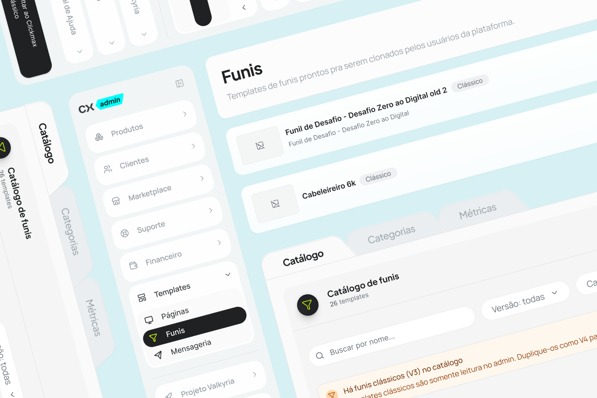
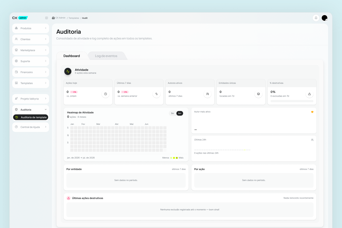
CX Admin scope: seven modules today, with room for more without a structural redesign.
Takeaways
- Cross-stack, with discipline. A designer who ships code only adds value when the team is part of the process: developer code review, QA validation, granular PRs. AI speeds up execution; the team guarantees quality. Skip that discipline and it turns into debt.
- Cost-driven discovery. The change with real impact wasn't visual, it was structural. Knowing where effort pays off (in the operator's flow, in engineering throughput) changes the conversation with stakeholders.
- Working with a Design Lead. Splitting scope with André (him on Products/Customers, me on the sidebar and templates) took alignment on patterns, pace and visual language. Senior designers don't work alone. They pair with whoever holds the team's vision.
- Shaping comes before execution. So few QA fixes on a scope this size isn't luck. It comes from investing in the step before code: understanding the problem, splitting it into PRs, making the criteria clear.
Next case study

Baralho de Vieses
Identity, 110+ illustrations and the website for a cognitive bias card deck with 10k+ units sold.